Untangling airline booking to reduce friction
Reconstructing flight booking user-flow.
Choosing fares creates more frustration than any other step of booking a flight
In this project, I experimented with how I could reduce the friction by simplifying the user flow.
Removing fare selection entirely
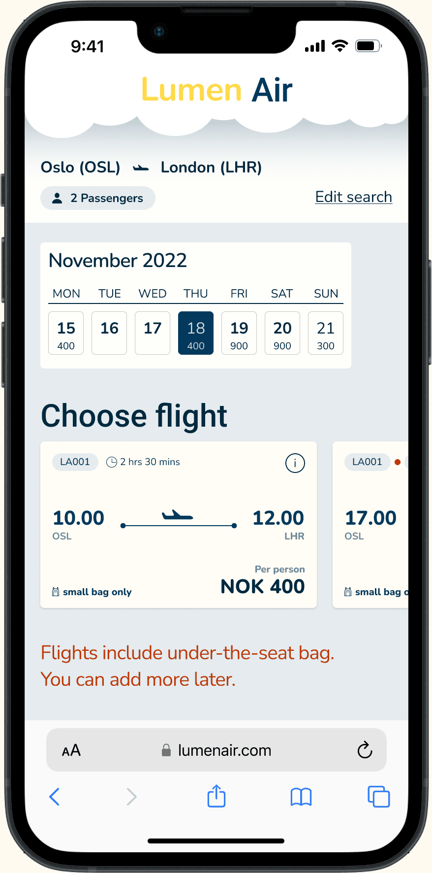
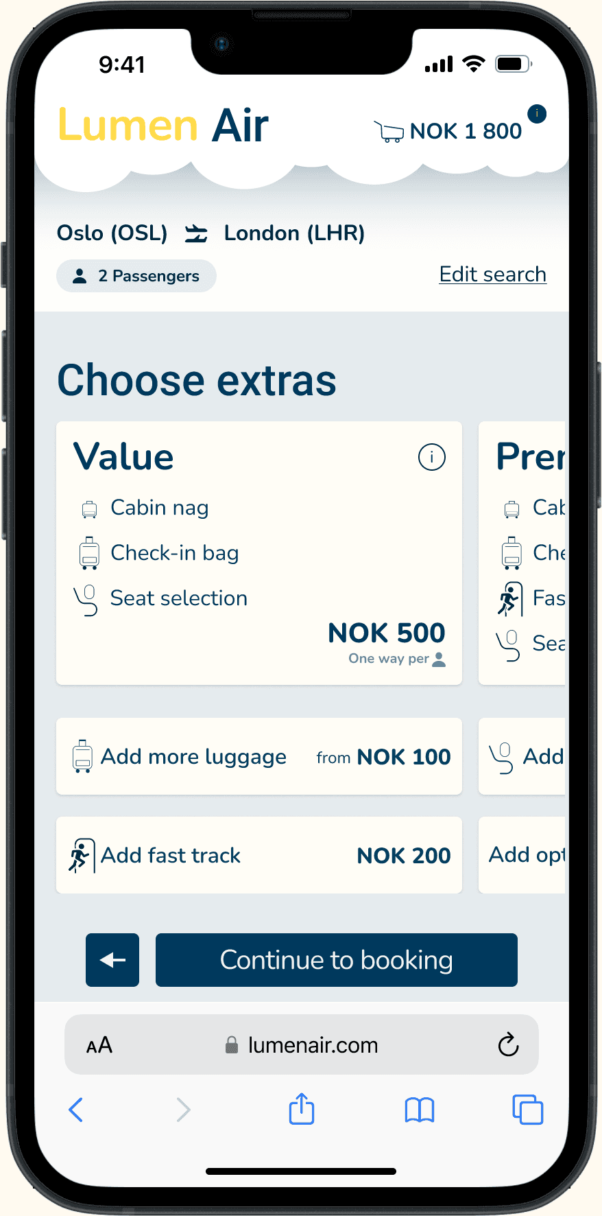
Fare selection was the single biggest source of confusion: users didn't understand the tiers, couldn't find what was included, and often didn't realize a selection was required before proceeding.
Remove the fare step entirely. The flow becomes three clear phases — find your flights, choose extras as bundles or individual add-ons, and book. Testing showed users completed purchases faster and didn't notice the fares were gone.
Testing swipe navigation, then letting it go
Instead of traditional “Next” buttons, I explored swipe-up gestures for moving between steps — borrowing the scrolling behavior users already know from social media.
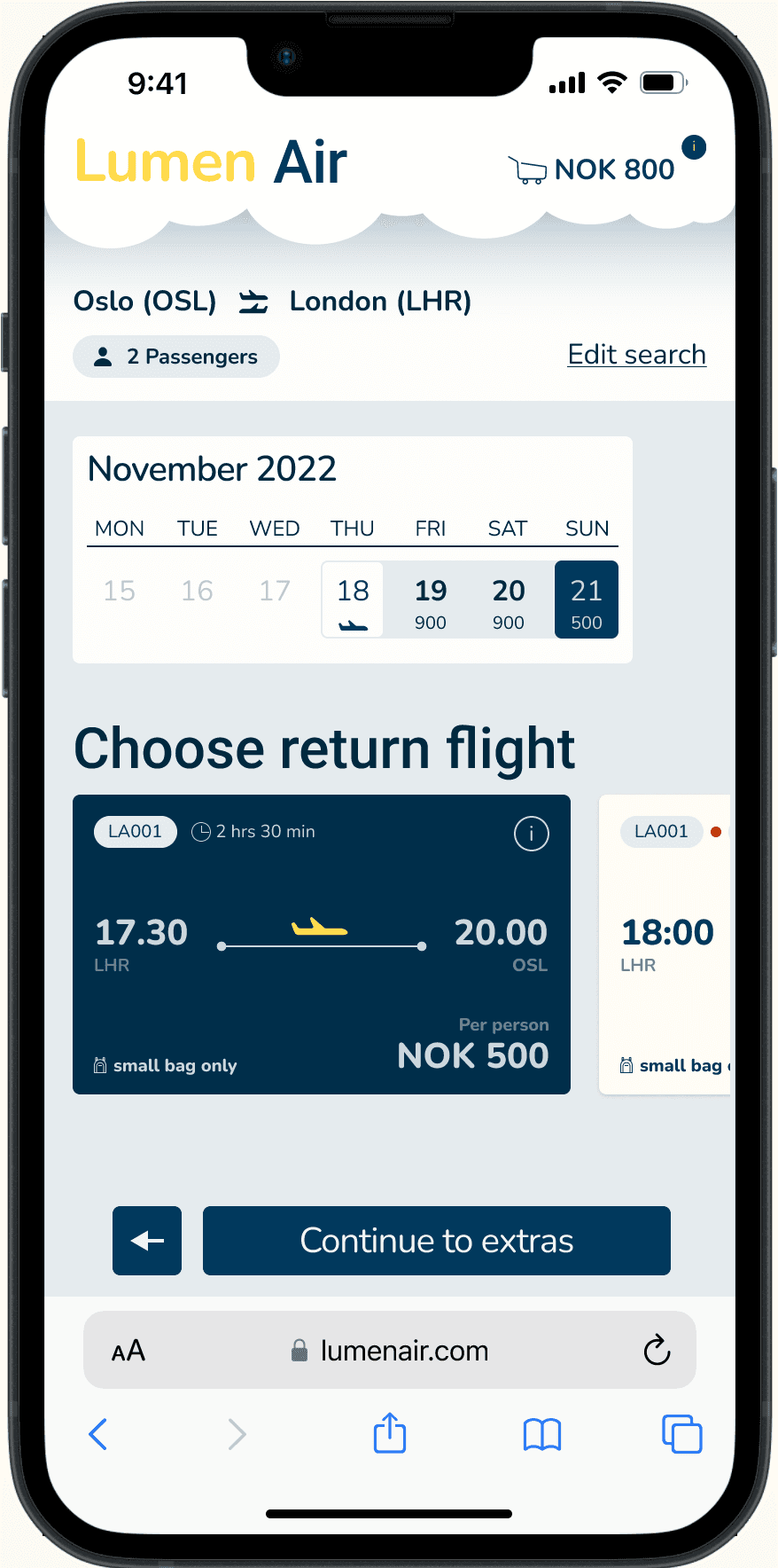
User testing revealed that without strong enough signifiers, users didn't recognize the swipe action — they looked for a button. That first moment of confusion was a barrier.
The final prototype replaced swipe with conventional buttons. Innovation that creates confusion isn't innovation — established patterns kept the sense of flow without the learning curve.
Designing clear signifiers for every interaction
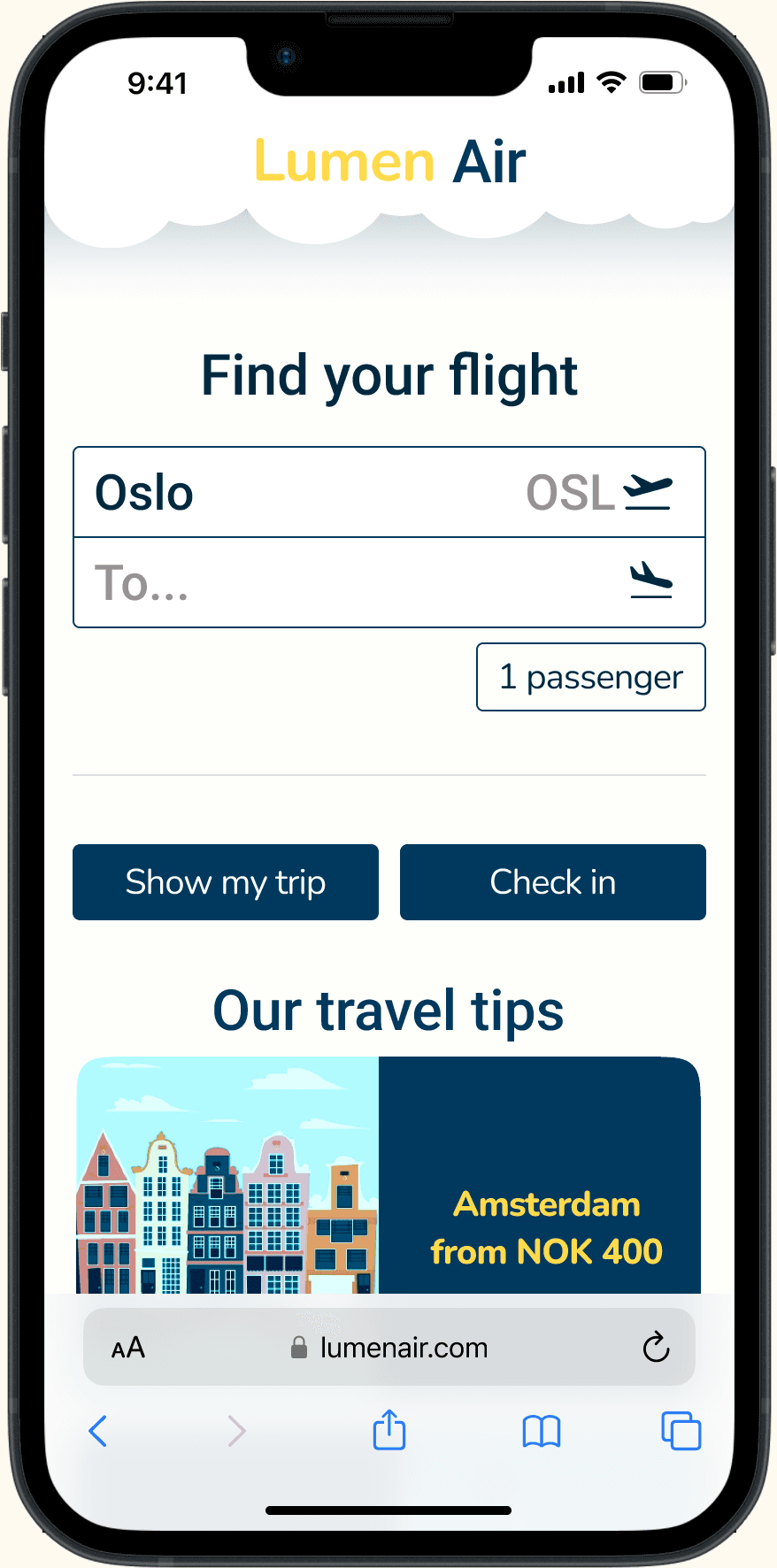
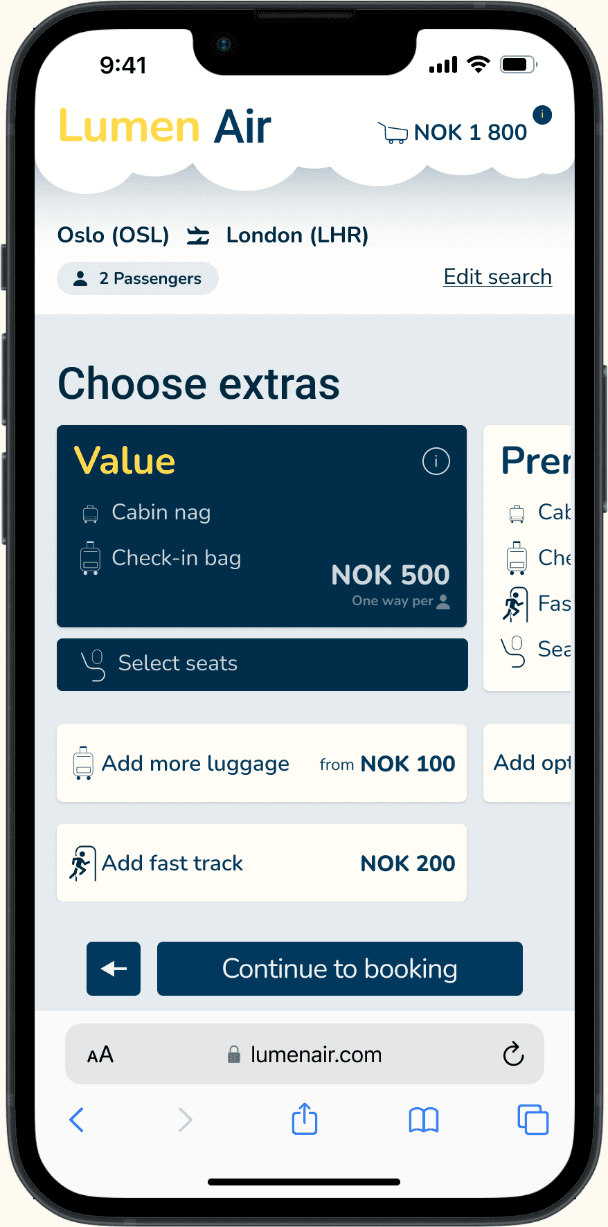
During user testing I saw that users couldn't always distinguish between clickable and non-clickable elements across airline websites. Buttons looked like headings. Cards didn't indicate they were selectable. Selected states were ambiguous.
I developed a clear visual language. Selectable cards (flight options, extras bundles) have a subtle shadow as if floating, signaling “pick me up.” They sit in horizontal carousels that users can swipe through. Action buttons use flat design with strong contrast and verb-led labels (“Continue to booking”, “Add return flight”) that clearly communicate what will happen. Selected states use a distinct dark background with high-contrast text, leaving no doubt about what's been chosen.
The result was a consistent visual hierarchy. Users always knew what could be selected, what was selected, and what action to take next.
The process behind the decisions
Choosing flights and fares creates the most pain
To understand where users struggle, I conducted competitive benchmarking across five airlines (British Airways, Flyr, AerLingus, EuroWings, American Airlines), ran an online survey, and performed usability tests. The research data was synthesized collaboratively with a team of three UX design students through affinity diagramming, using natural grouping followed by a cross-referencing matrix of heuristics and flow stages.
Key insights from research

Three principles to guide the redesign
What worked, what I learned, and what I'd do differently
Outcomes
Learning points
Leverage conventions. Users rely heavily on established design patterns. The swipe experiment showed that introducing new interactions requires very strong signifiers and gradual adaptation. Innovation that creates confusion isn't innovation.
Test earlier and rougher. Testing journey sketches and low-fidelity prototypes earlier could have highlighted the swipe navigation issues sooner, before investing in high-fidelity implementation.
Prototype fidelity should match the risk. Use low-fidelity prototypes for testing risky hypotheses and new interactions early. High-fidelity comes later for visual refinement, not for validating whether a concept works at all.
Process as a skill. This project taught me how to structure a full UX process end-to-end: setting goals, planning research, analyzing findings, ideating concepts, and iterating prototypes. It deepened my understanding of UI design principles and the importance of a cohesive design system.