Safe and intuitive interfaces for forklift operators
A scalable, multi-application HMI for industrial forklifts that helps operators answer their question in a single eye fixation, without taking their attention off their task.
Modern forklift screens are full of information, yet operators still drive on muscle memory
Workplace transport is the second biggest cause of fatal workplace accidents, and forklifts account for a major share of these incidents (European Agency for Safety and Health at Work). Even though forklifts now ship with screens, field interviews, observation and video studies showed that screens are under-used. Operators learn to ignore the screen and rely on feel.
How can we keep forklift operators safe without competing with the task in front of them?
Key insights from research
Three commitments
Two levels of preventive notifications
To prevent accidents before they reach a critical threshold, not just react to them after.
Two severity levels: a dismissible warning that nudges the operator, and a hard lock that requires corrective action before proceeding.
Motion draws attention to the notification on entry. The operator can minimise a warning to keep the working area visible. Critical notifications lock the system and blink the offending indicator. Both levels use animation rather than colour alone, so they work for colour-blind users.
Aiding the operator's mental model
Offload operator's working memory, help them predict the consequences of their actions, and draw attention to the information that matters most in each moment.
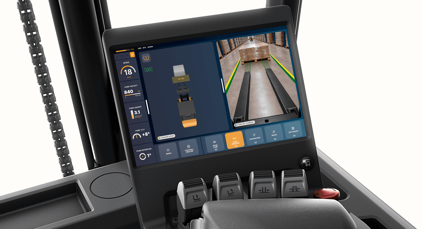
The system renders the forklift's immediate surroundings and responds dynamically to the operator's inputs.
When approaching a load, the fork camera activates with a predictive overlay showing alignment. When the operator adjusts height, tilt, rotation, or weight shifts, the corresponding indicator enlarges, making the necessary information resolvable at a single glance.
Freedom of control
Different operators work differently. Giving full control over layout lets each person arrange the interface around their own task flow and physical position.
An adjustable interface supporting split-screen and picture-in-picture layouts, with drag-and-drop application switching.
Capsule-shaped containers signal that elements can be moved. A 6-dot grip handle and a visible drop zone make the drag-and-drop mechanic discoverable without onboarding.
Validation: a second interview, with the prototype running
The operator confirmed the layout: information on the left, controls at the bottom. The layout matched their natural hand position and did not interfere with critical information or gaze patterns. The split-screen combined with the fork camera was named the strongest single feature.
Open questions raised: drag-and-drop discoverability without onboarding, the absence of haptic feedback, and how the system behaves when the operator is wearing winter gloves.
What I'd do differently
Use AI earlier to overcome the fear of the blank canvas. Faster iteration on form allows more time for user research, the part that matters most in safety-critical design.
What I learned
The hardest part of safety-critical design is not adding features. Understanding and applying human-cognition theory must take priority over personal preferences and assumptions.